Coast Science
CLIENT: Coast Science / Coast Science Pro
LOCATION: San Diego, CA
DELIVERABLES: Logo Redesign | BRANDING | PACKAGING | WEBSITe REDESIGN
Overview:
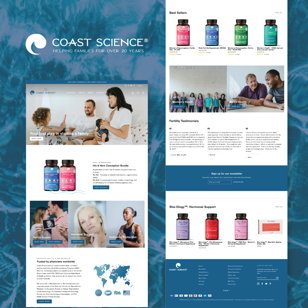
Coast Science approached me wanting an updated website as well as updated branding and labels for their supplement line. I wanted their new look to reflect a trusted and established brand as they have been in business for over 20 years well as look modern and approachable to consumers that were looking for supplements to support them in their fertility journey.
LOGO & BRANDING:
I updated the typeface to a more modern font and design that reflected the “coastal San Diego” based company but wanted to keep the logo mark the same. I thought it was a strong mark and was able to translate well to the new look of the company.
Bottle Labels:
The old packaging had outdated photography and imagery. The key components on the old label consisted of various logos that looked more like body building supplement products rather than a family-friendly trusted brand. One of the main asks during the redesign was to keep the matching colors of the current bottles. Custom icons were added to the front of the bottle to distinguish the key features for marketing that were not currently on the original labels. I am thrilled with the outcome of these labels on the new amber PET bottles with black top.
Website:
As the company grew they expanded beyond just fertility products, their new products were hidden in pages outside of the home page. The company has 17 different products and their new site now showcases the categories accessible right on the home page as well as a bundled product that I created to help sell a His & Hers fertility bundled item.
The old website had a messy navigation with categories that were accessible in different sections of the website. I created a “mega header” where you hovered over the “Shop All” another navigation would pop up allowing the consumer to pick a category. When you click “Shop All” all of the products are now are categorized and the consumer can filter through the various products depending on their needs.
Shopify Features:
Another big feature that was implemented was quantity break pricing. The old website had a chart underneath the buy button that would show you the percentage discount offered you could get if you added X amount of products to the cart. Now with Shopify there are 3 bundles you can buy and just by clicking the bundle you can see exactly what the price would be and how much you can save. Consumers no longer have to add the product to cart to see how much it would cost after savings.
The team is very happy with the redesigned website and product labeling!
Here are some alternate concepts that were presented to the client that didn’t make the cut:
